CASE STUDY




Sokin
Redesign Onboarding Flow
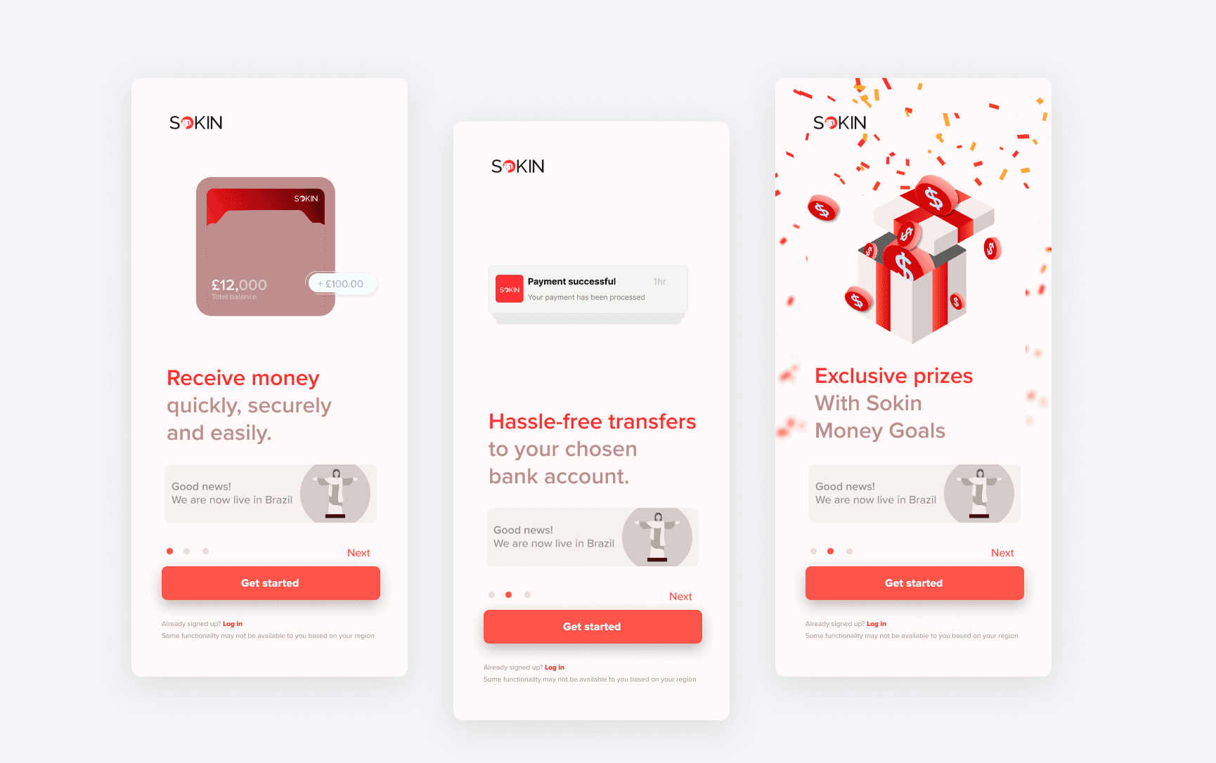
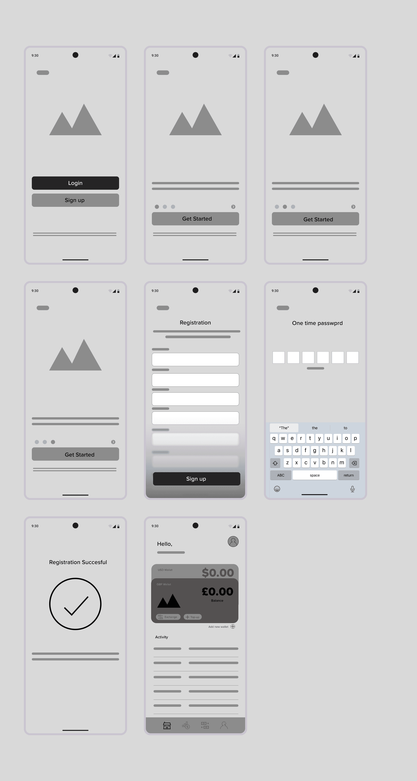
The Brief Sokin is a global payments platform built to remove the barriers businesses face when moving money internationally, promising transparent, fast, low-cost transfers without hidden fees. The challenge was twofold. The first was one of brand: Sokin's visual identity needed to be defined and evolved consistently across every customer-facing touchpoint. The second was operational: onboarding was slow, drop-off was high, and friction in the sign-up and verification flow was costing the business customers before they'd even used the product. My Role: I was responsible for creating campaign identities, illustrations, iconography, graphics, presentations, and launch assets. As well as identifying the friction points, mapping the improved journey, and delivering wireframes for the redesigned onboarding flow. Process Brand Identity Core responsibilities spanned social content, motion graphics, campaign identities, illustrations, graphics, and presentations translating complex financial software capabilities into simple, engaging brand experiences across web, product, and marketing. I created social content, motion graphics, campaign identities, illustrations, graphics, and presentations for the Sokin brand. As well as collaborated on UI/UX concepts for Sokin products, working to enhance functionality and aesthetic appeal across multiple features. Onboarding & UX began with hands-on user testing, working through the existing app systematically to identify bugs, points of confusion, and unnecessary steps in the flow. I then conducted UI assessments and provided actionable usability recommendations. Built user flows mapping how the onboarding journey could be restructured to reduce friction and drop-off. Designed wireframes for the improved onboarding sequence, from landing through registration, one-time password verification, and into the first authenticated dashboard state. Partnered with Product and Engineering to translate research findings into a streamlined, low-friction sign-up and verification flow. The Outcome Outcome Improved product interface and user satisfaction by 20%. Reduced friction across the sign-up and verification flow, addressing a key source of pre-activation drop-off. Established a more cohesive, scalable visual identity across social, campaign, and product surfaces, supporting consistent brand recognition as Sokin expanded across regions.
Services
UX Strategy
User Research
User Journey
More Projects
My recent projects
GTN
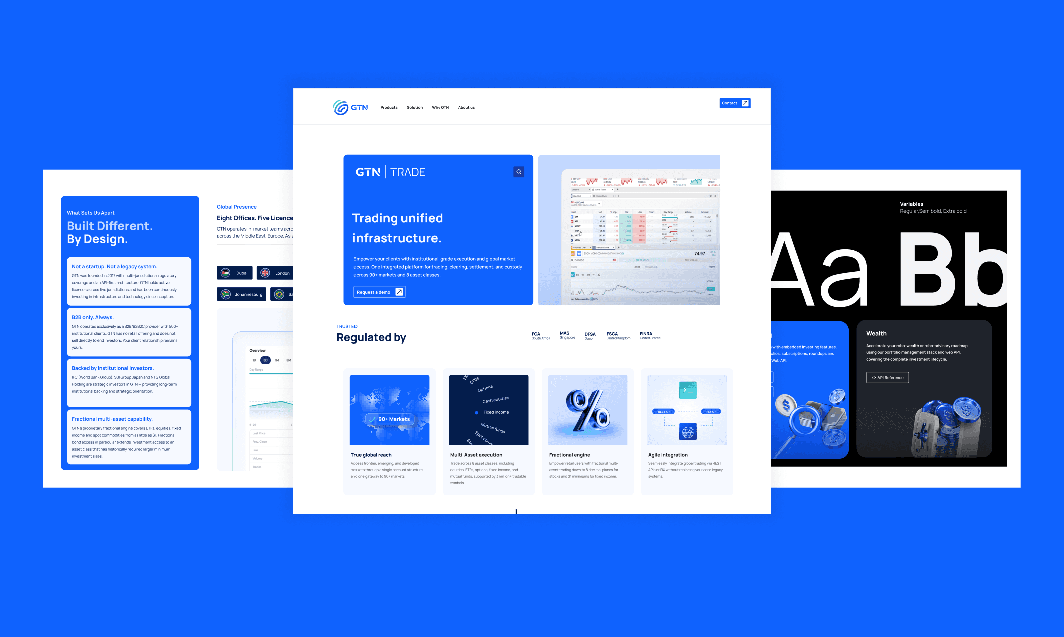
The Brief GTN is a global investment infrastructure provider, a single API giving brokers, banks, asset managers, and fintech platforms access to 90+ regulated markets and multiple asset classes across jurisdictions worldwide. The company occupies a rare position in the market: it has the agility of a fintech and the depth of an institutional player. The rebrand's goal was to make that positioning visible. GTN needed to sit confidently beside fintech-native competitors, while simultaneously signalling the institutional credibility that differentiates it from them. My Role Lead designer within the marketing team, reporting to the CMO. I worked across a multidisciplinary team including a web designer, product managers and developers, regional campaign managers, sales teams, event booth designers, and senior stakeholders. As GTN scaled across 6 global regions, the brand needed a unified visual identity and a scalable design system that could support an increasingly complex mix of teams, product surfaces, and marketing channels, from the trading app to the corporate website to region-specific campaigns. The Process I began with competitive research, mapping how GTN's key competitors presented themselves visually and what positioning gaps existed. From that I built a rebrand strategy and creative direction, then executed it across every GTN touchpoint: brand identity, design system, website, social media, event spaces, marketing collateral, motion graphics, and embedded product UI. The sitemap and information architecture were rebuilt from the ground up to reflect GTN's expanded product suite and global regional structure.Process Design System & Brand Identity I then spearheaded the creation, implementation, and evolution of a design system of 100+ components, working across web, product design, social, paid advertising, events, presentations, email, and video. Next was to create and redefine GTN's brand identity for the fintech space across every customer-facing touchpoint. I built a suite of templates and creative frameworks adopted across 6 global regions, improving brand consistency and efficiency company-wide. Web & Developer Portal I designed the GTN corporate website end-to-end, reporting directly to the CMO and collaborating with an external developer on build and implementation. I unified the design and branding of the web and developer-portal experience, including designing its login and registration flows. Leadership & Creative Direction I Managed one junior designer and one design intern, providing creative direction and quality control. I also provided creative direction for key product launches, campaigns, announcements, and strategic initiatives across 6 global regions. The Outcome I delivered a scalable 100+ component design system adopted across product, marketing, and corporate channels. As well as improved brand consistency and design efficiency across 6 global regions. In addtion i unified GTN's web and developer-portal experience under one cohesive design language, from first touchpoint through login and registration. I built and mentored a small design team, embedding creative standards and quality control into day-to-day output. The rebrand supported multi-region LinkedIn awareness campaigns across the US, LATAM, and APAC markets, providing the first real-world test of the new brand's performance at a senior audience level. Across three campaigns the creative generated over 67,000 impressions, reached approximately 4,900 unique decision-makers, and delivered 357 total clicks. The US campaign achieved an average CTR of 0.81% nearly double the US B2B fintech industry standard of 0.40%–0.45%. Senior decision-makers engaged with the refreshed GTN brand across institutional banks and fintech platforms including Morgan Stanley, Kotak Mahindra Bank, ICICI Bank, BTG Pactual, Bradesco, UOB, CIMB, Fidelity Investments, and BNY Pershing precisely the audience the rebrand was designed to reach. Top job titles engaging with the campaigns included Partners, Vice Presidents, Senior Directors, and Investment Directors across all three regions. The Americas homepage generated 971 sessions and 892 active users during the US campaign period. The global homepage generated 1,852 sessions and 1,600 active users during the LATAM campaign window. The full impact of the rebrand will be measurable upon website launch, at which point GTN's repositioned identity as the bridge between fintech agility and institutional expertise will be fully visible in market for the first time.

Illustration design
A selection of Illustrations
LET’S WORK TOGETHER